
Skuma — Simplifying School Management with an Intuitive Dashboard
A personal dashboard design exploring school management, inspired by real work on an LMS platform at Kotakodelabs — built with Radix UI as the design system.
💡 Fast Overview
The dashboard helps school administrators manage departments, rooms, teachers, students, and parents — all in a simple and intuitive way.
It's not just another dashboard — it's a tool that helps schools breathe easier. — Skuma
Context
While working at Kotakodelabs as a UI/UX Designer, I was part of the team building Fina (Financial Admin Dashboard and LMS (Learning Management System)
Skuma is a personal exploration built on that similar domain problem — school management from the Admin's perspective (Departments, Buildings, Divisions, Parents, and Students) — not the actual delivered client work from that engagement. I designed it independently using Radix UI Components (Figma Community) as the design system, and collaborated with my friend Nuril Ichsan, who wrote the English copy used throughout the interface.
Constraint
- Personal project, not a client deliverable — this is my own take on a domain problem I understood from real work experience, not the actual Fina product or screens
- No formal user research was conducted — design decisions are based on domain familiarity and design intuition, not validated research
- The "usability check" later in this case study was a self-review, walking through the core tasks myself — not testing with outside participants
Overview
Skuma is a modern school management dashboard designed to help administrators manage daily operations — from departments, rooms, and staff to students and parents — all in one clean, intuitive interface. Built with a focus on clarity, consistency, and efficiency, Skuma makes school management simple, visual, and effortless.
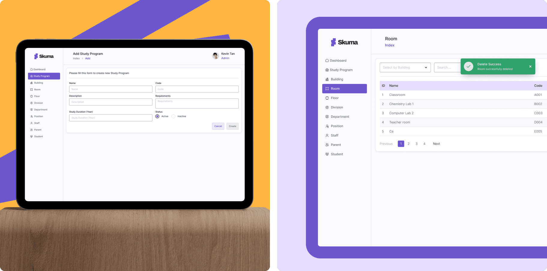
What Makes Skuma Different?
- Focuses on ease of use for non-tech-savvy school admins
- Uses a modular dashboard system so every data section feels familiar and organized
- Designed with Radix UI components, ensuring both aesthetic consistency and dev-ready usability
Design Philosophy
Data-heavy doesn't have to mean confusing. Skuma was designed to simplify complex data structures through visual hierarchy, clean layouts, and component-based systems — helping admins find what they need in seconds.
Intended Persona
Design assumption based on domain familiarity, not formal research:
- 🎓 School Administrators & Staff
- 👩🏫 Teachers and HR Teams managing academic data
- 🏫 Private & International Schools that require a scalable system
- 💻 Comfortable with digital tools but prefer simple, intuitive dashboards
Core Features
- Dashboard Overview: Key metrics at a glance — total students, active staff, room usage, etc.
- Department & Building Management: Create and organize departments, rooms, and floors easily.
- People Module: Manage students, parents, and staff in one place.
- User Roles & Permissions: Keep data secure with layered access control.
- Reusable UI Components: Built with Radix UI for consistency across screens.
Visual Direction
Skuma adopts a clean, calm, and modern aesthetic — using soft color palettes, clear typography, and intuitive spacing. The goal: make the experience feel professional yet friendly, removing unnecessary visual noise that distracts from the data.
Benefits
- Simplifies Management — Everything from departments to rooms in one dashboard.
- Speeds Up Admin Workflows — Clean structure reduces time spent on repetitive tasks.
- Reusable Components — Easier handoff and scalability for developers.
- Improved Navigation — Logical flow ensures users never get lost.
- Consistent UI System — Every page feels familiar, reducing cognitive load.
Why Skuma Matters
Skuma offers a unified, intuitive space — making admin tasks smoother, faster, and more visual. It's not just another dashboard — it's a tool that helps schools breathe easier.
Process, From Sketch to Launch
1. Discovery & Definition
First, I defined the project's purpose: to simplify how school admins handle data — departments, buildings, rooms, staff, students, parents — so everything is manageable in one place. I set key goals: create a clean interface, build a reusable component system, and make it dev-friendly.
2. Information Architecture & Flows
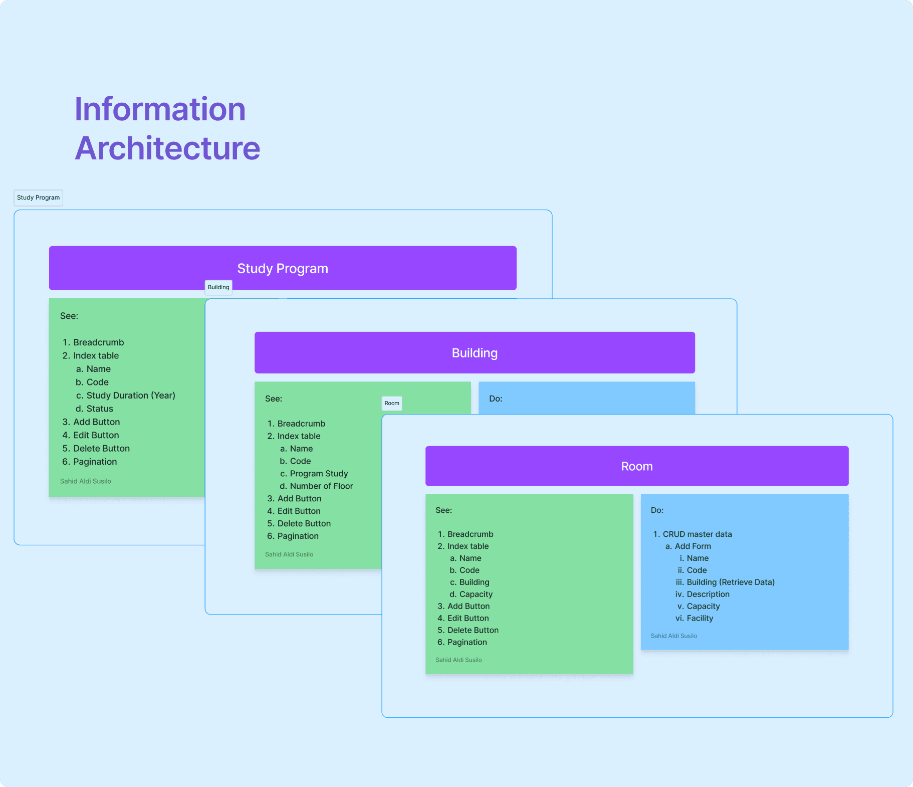
I mapped out all the data entities (study program, building, floor, room, division, department, position, staff, parent, student). Then I laid out logical flows: adding new rooms, managing staff, linking students and parents. This helped me ensure the dashboard structure felt intuitive.
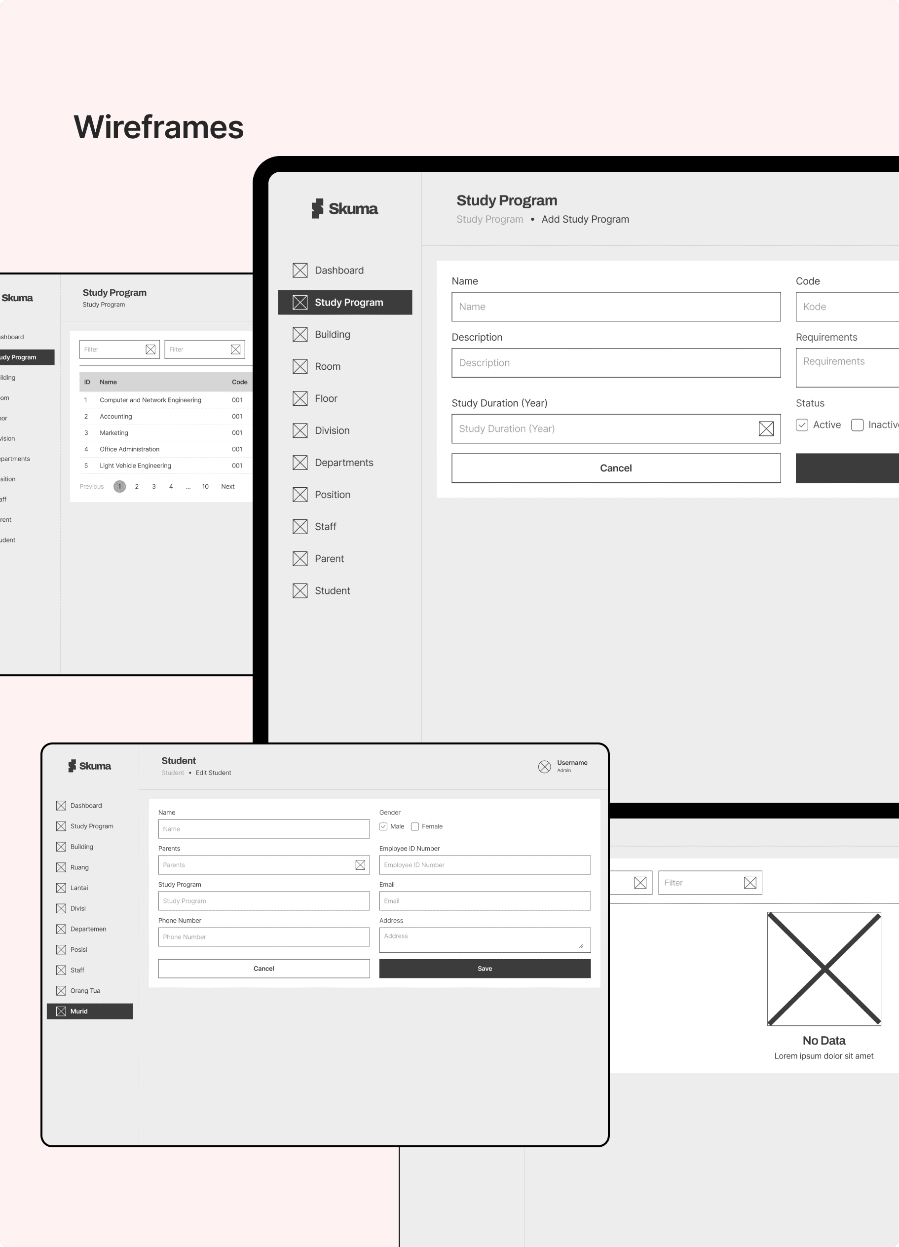
3. Wireframes
Next, I moved to wireframes: quick sketches to lock down layouts and user flows. I focused on readability and clarity — tables with clear headers, forms that don't overwhelm, action buttons that stand out.
4. Design System + Radix UI Components
To keep design consistent and implementation smooth, I built a design system based on Radix UI (Figma Community).
- Defined tokens: colors, typography, spacing.
- Created components: buttons, inputs, dropdowns, modals, tables.
- Ensured accessibility and reusability for developers.
5. High-Fidelity Mockups & Visual Polish
With the system ready, I designed high-fidelity screens: login, dashboard overview, study program module, building module, room page, etc. I chose a soft but professional visual tone — spacious layouts, subtle colors, clear iconography — to make data work feel less heavy.
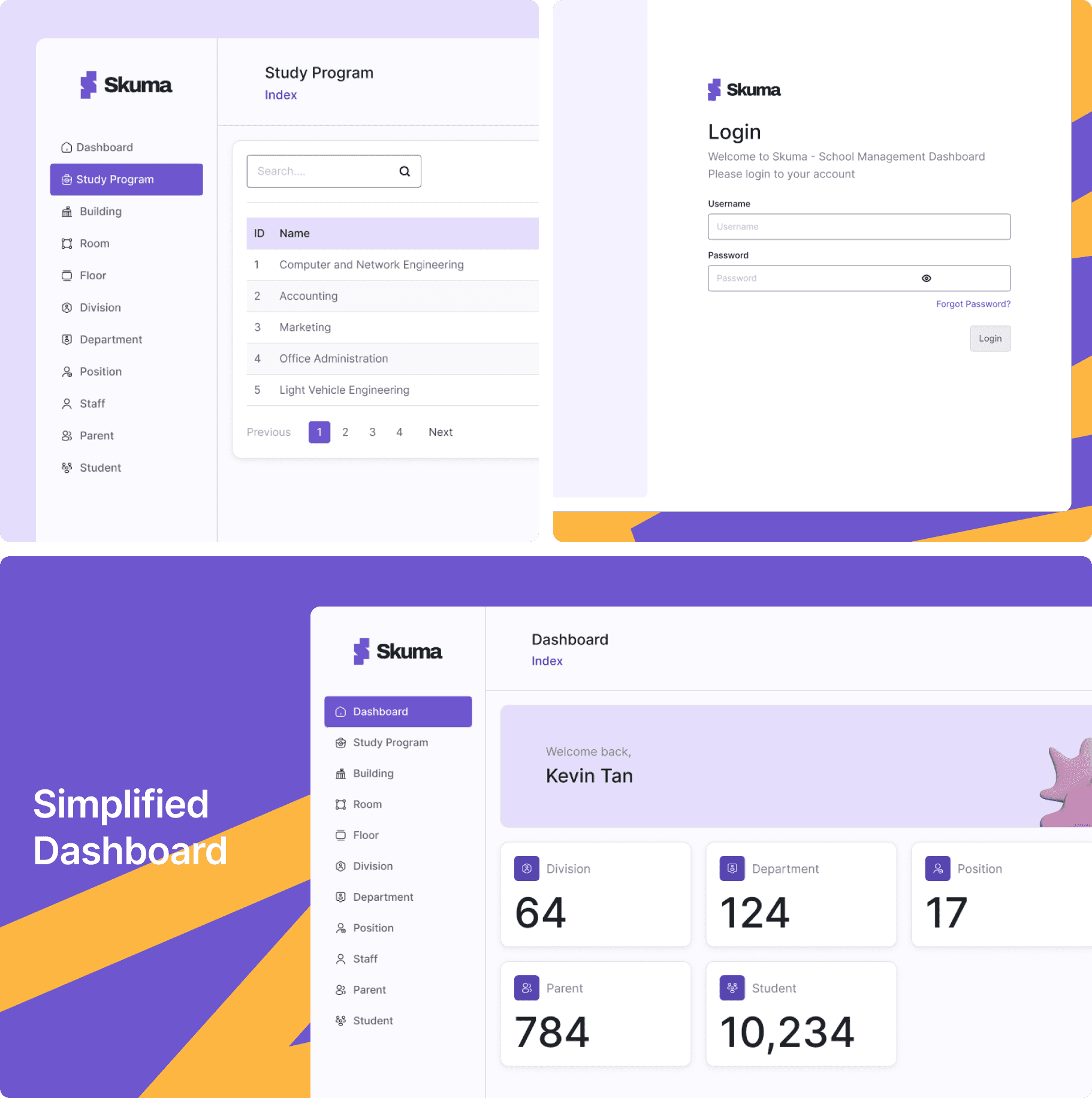
6. Prototype & Self-Review
I assembled a clickable prototype and walked through the core tasks myself — adding a student, assigning a room, editing staff details — as a self-review rather than a formal usability test with outside participants. From that review, I refined wording ("Save & close" instead of just "Submit"), added inline validations, and adjusted layout spacing for comfort.
✦ Conclusion
Skuma was designed with one clear mission — to simplify complex school management into a single, intuitive experience. By focusing on clarity, consistency, and usability, the platform aims to help school administrators manage data effortlessly without feeling overwhelmed.
Through a modular design system and well-structured information architecture, Skuma explores scalability for future features while maintaining a seamless user experience. As a personal exploration rather than a client engagement, it didn't get real user validation — that's the natural next step if I ever revisit it with actual school admin users.
This project reinforced my belief that great design isn't about adding more, but about making what matters most — visible, clear, and easy to use.
