
Montrack: Habit-Based Financial Tracker for Gen-Z
App that helps achieve your financial budgeting and goals
"A budget is telling your money where to go instead of wondering where it went." — Dave Ramsey
Fast Overview
Montrack is a habit-based financial tracker prototype designed to help Gen-Z build a consistent budgeting habit through goal-driven tracking, friendly nudges, and a fast expense-logging flow.
Timeline: Under 2 weeks · Method: Design Thinking · Tools: Figma, Miro, Google Form, Google Meet, Affinity Designer
Context
This started as a personal problem. While studying Visual Communication Design at Universitas Sebelas Maret, I struggled to keep track of my own spending. I tried a manual paper ledger first — too inflexible to carry everywhere. I looked at two existing apps: Buku Kas, which was solid but built for small businesses rather than personal budgeting and had no goal-setting feature, and Kelola Uang Pro, which came closer — good at logging income/expense and splitting funds — but still lacked a budgeting feature. That gap became the starting point for Montrack.
Problem
Before designing anything, I ran a validation survey to check whether this was a shared problem, not just mine. It collected 11 responses over about a week in September 2023 — a small convenience sample, not a statistically representative one, but enough to sanity-check the problem before committing to a design direction.
What the data showed:
- 100% (11/11) rated managing personal finance as important or very important
- 82% (9/11) had actively tried managing their finances before — but only 45% (5/11) had ever used a dedicated finance app, a real gap between intent and tooling
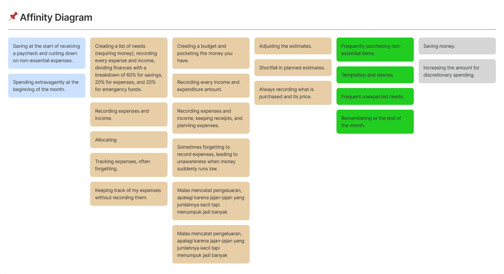
- Obstacles clustered into three recurring patterns: reluctant or forgetful about logging transactions (3 of 11), impulse spending they couldn't resist (3 of 11), and inaccurate budget estimates or unplanned expenses (3 of 11)
Problem statement: Gen-Z first-jobbers and students want to manage money and have tried before, but most haven't found a tool that sticks — mainly because logging feels like a chore and spending impulses are hard to catch in the moment.
Constraint
- Solo, self-initiated project — no client, no budget for paid research tooling
- Timeline about 2 weeks
- Research limited to free tools (Google Form for survey)
Approach
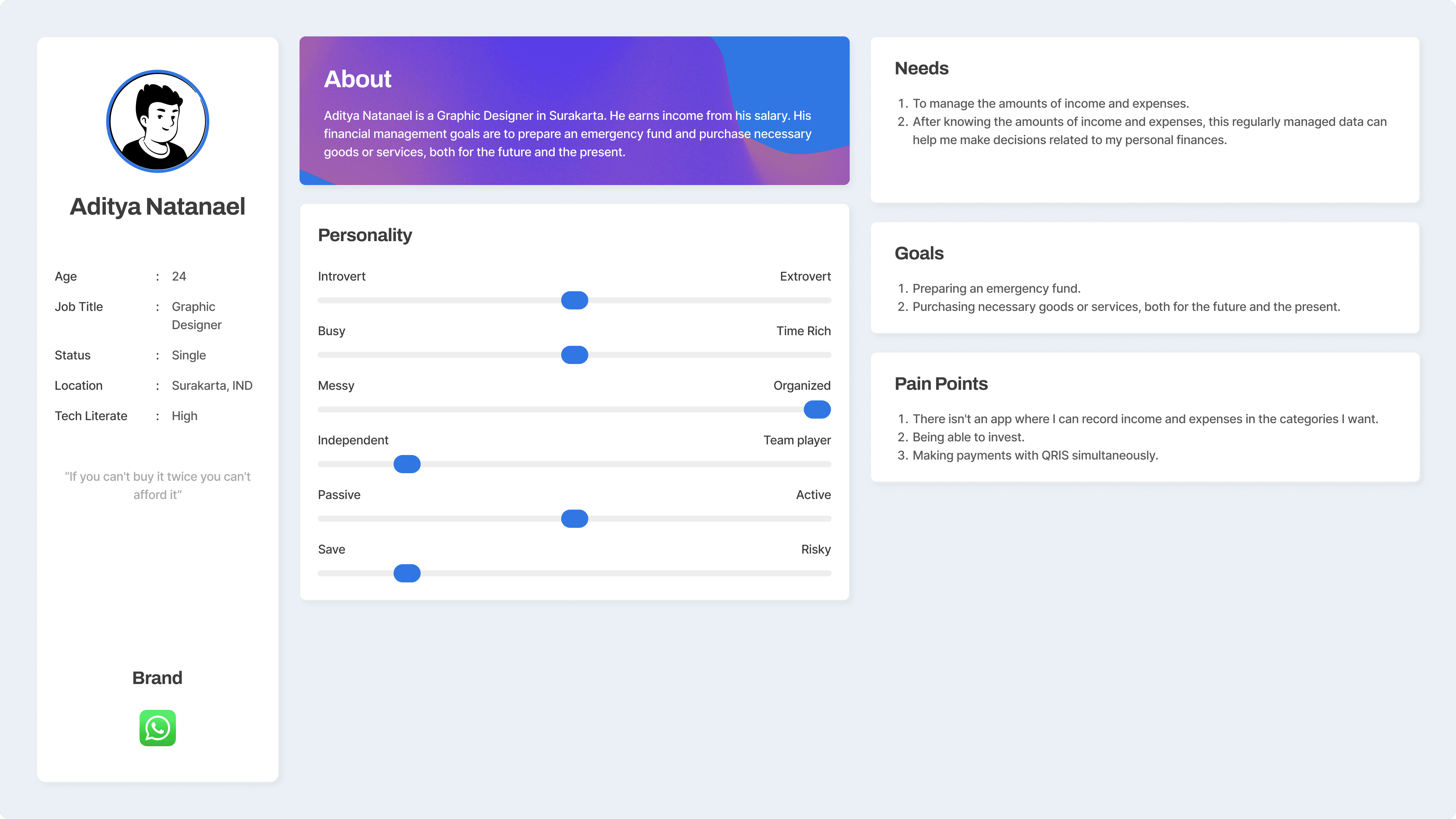
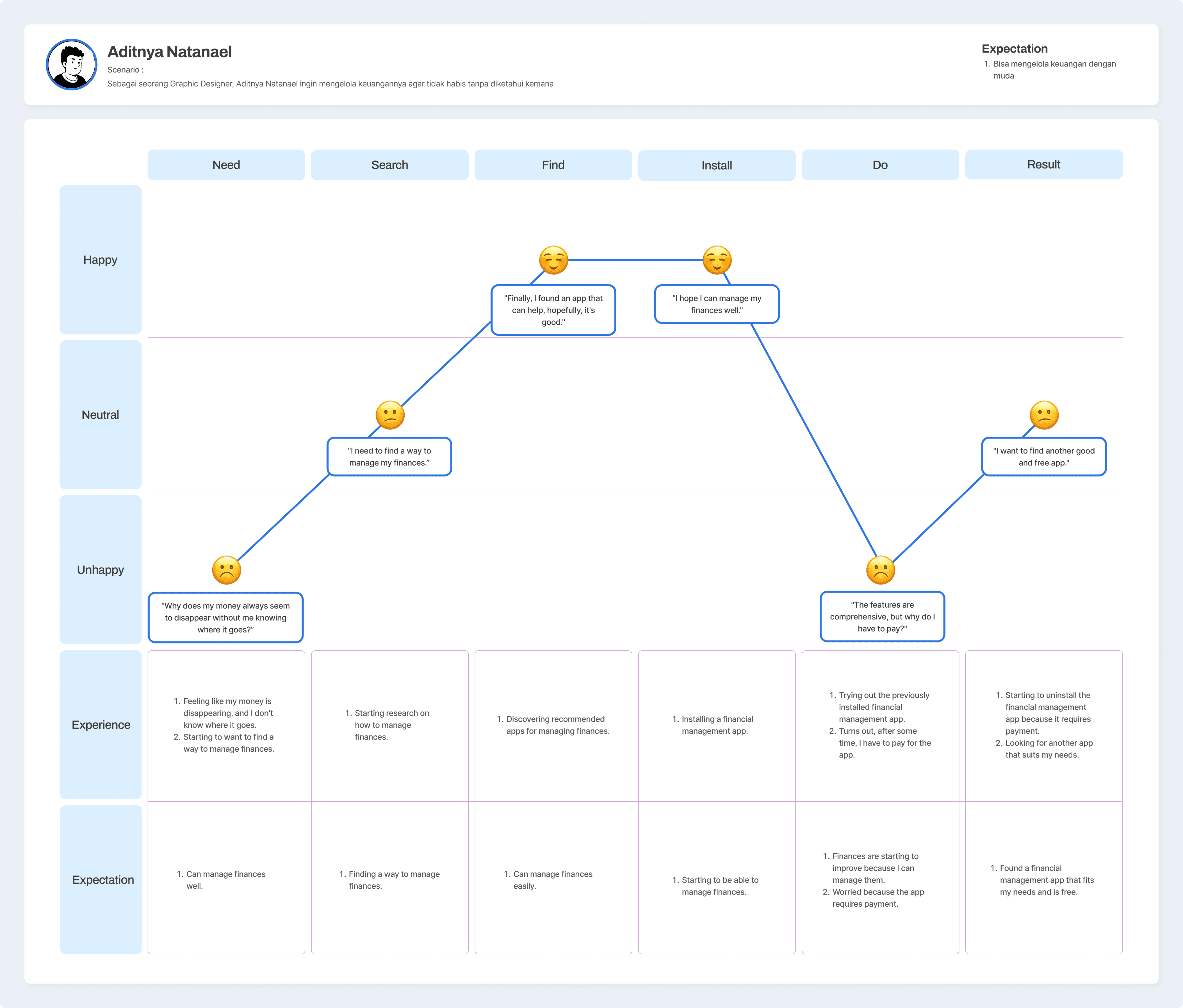
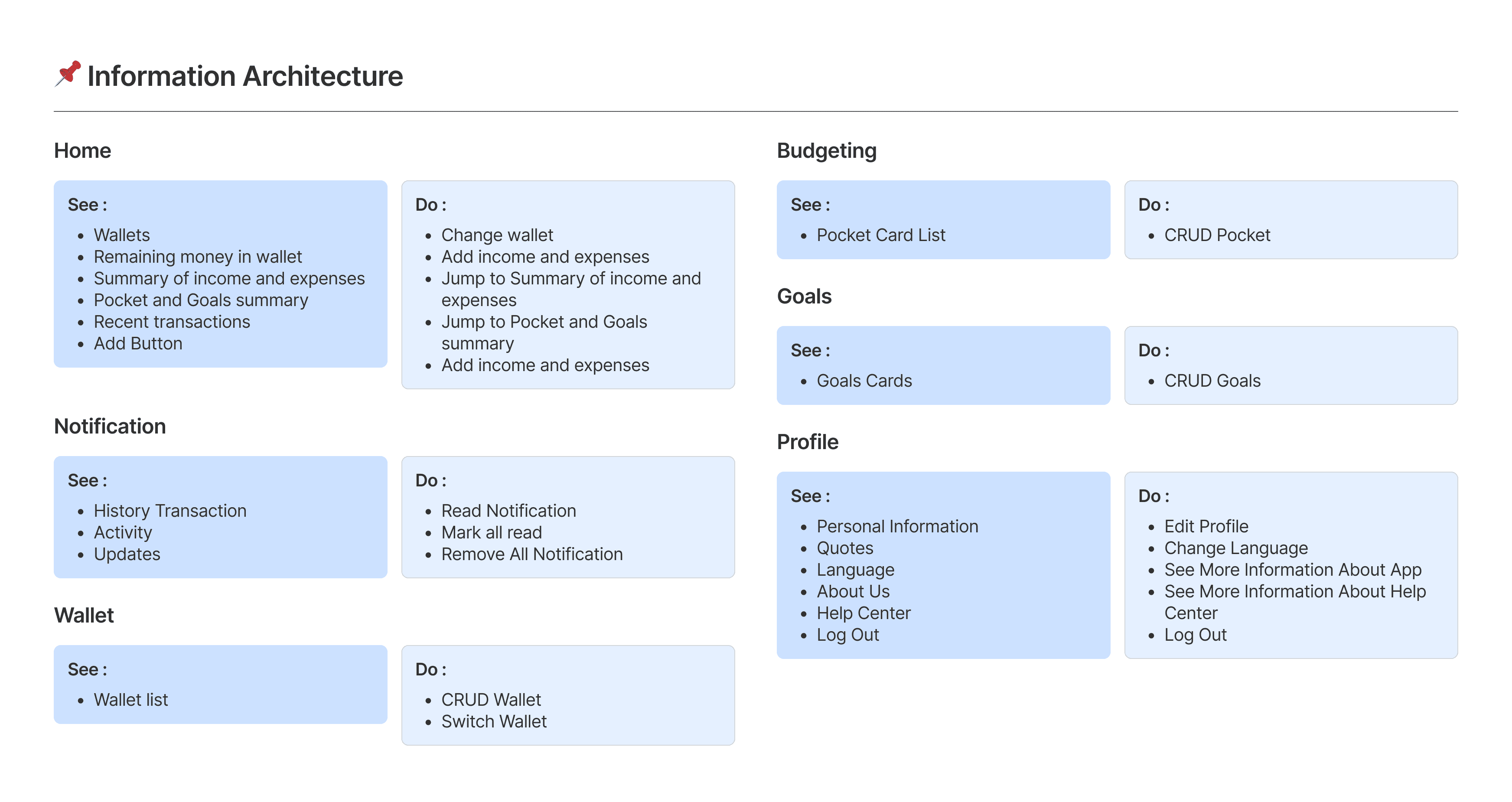
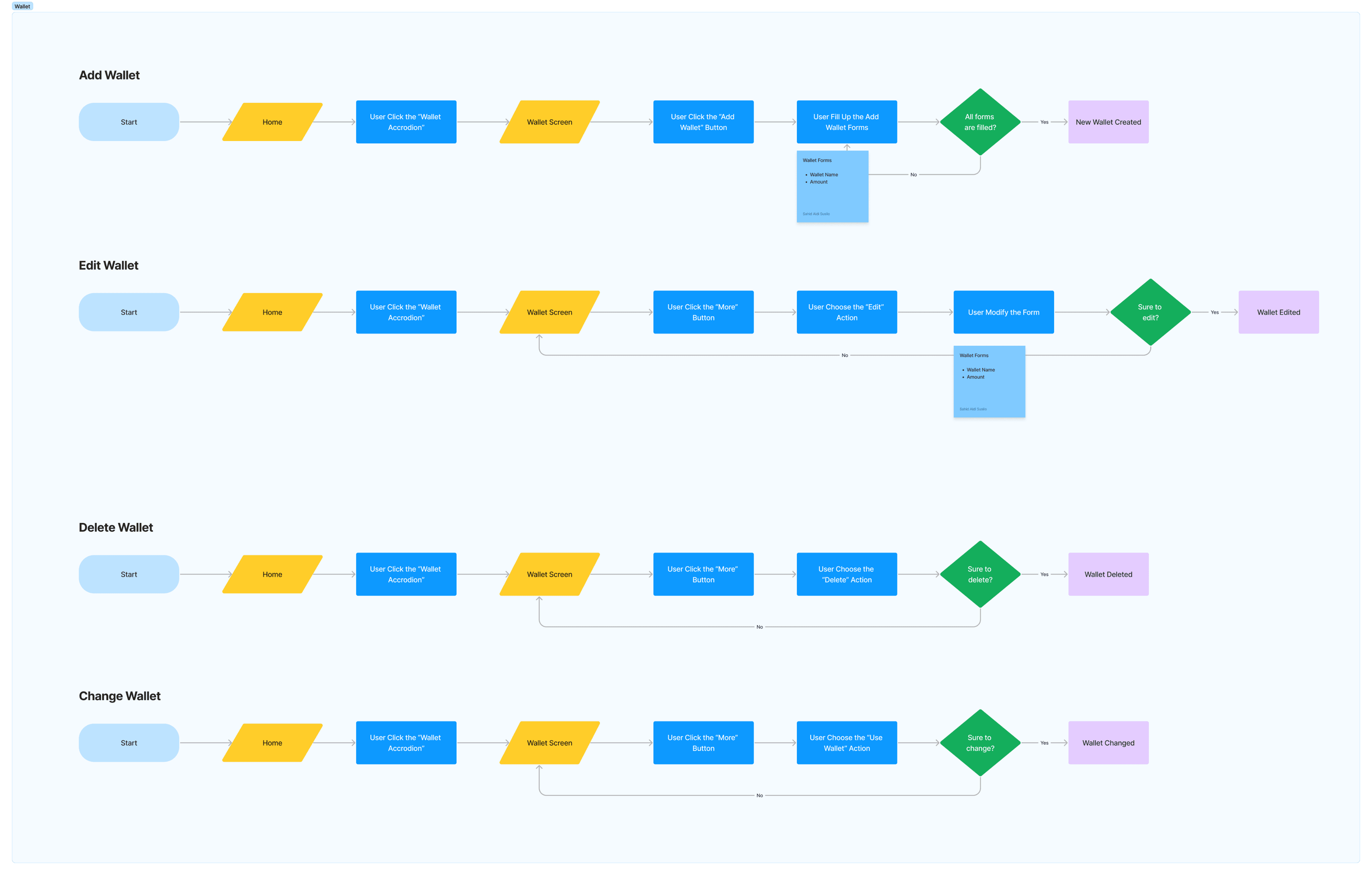
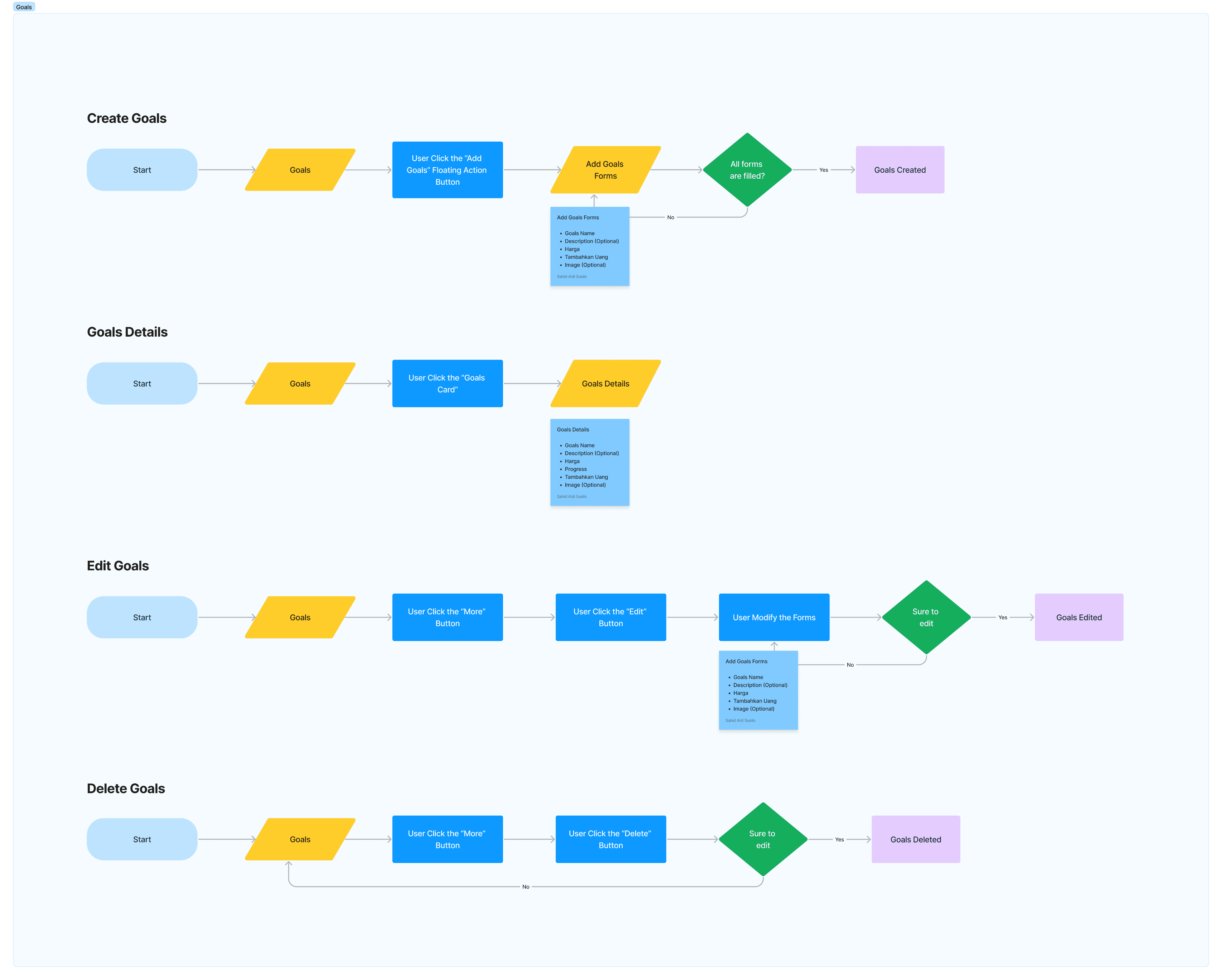
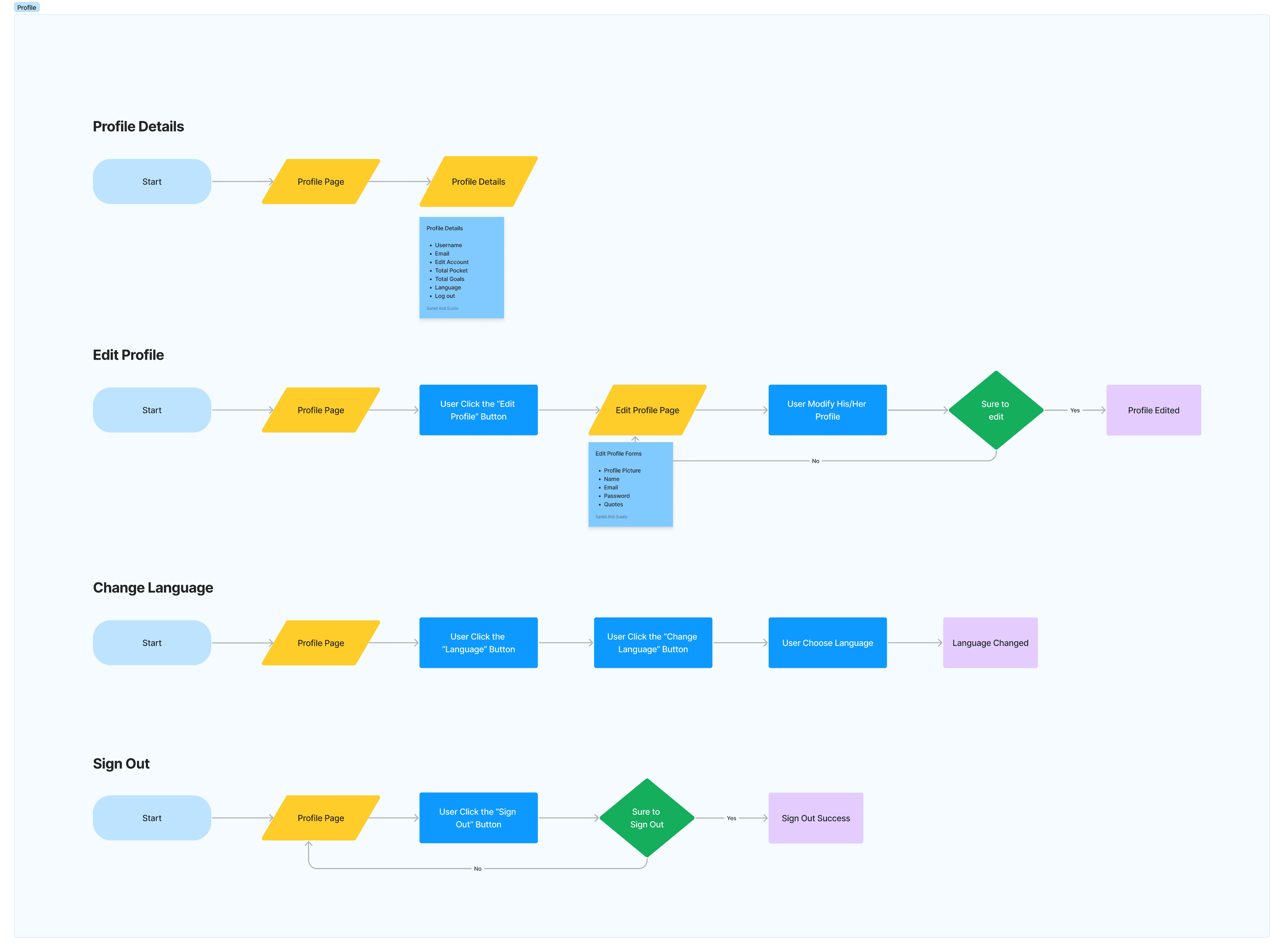
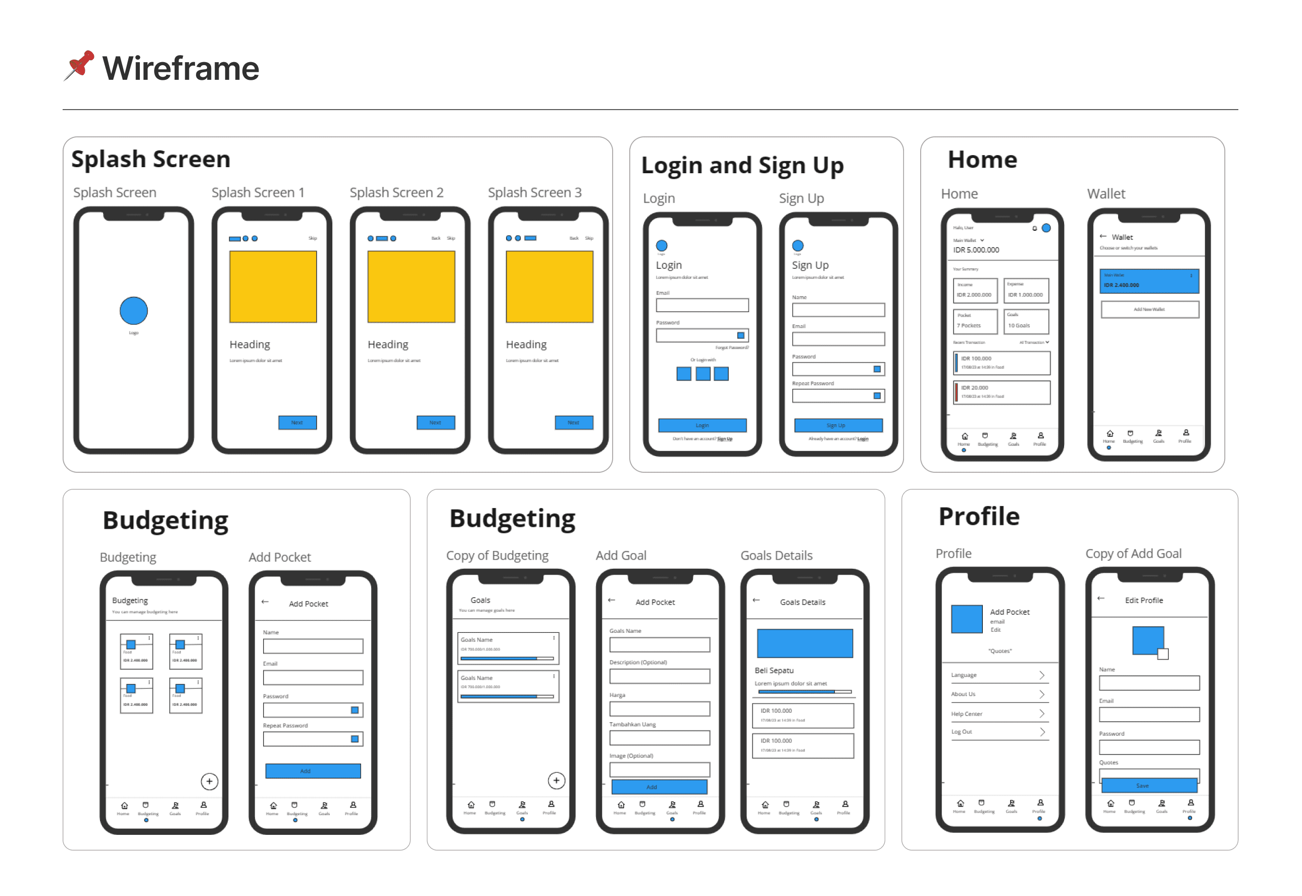
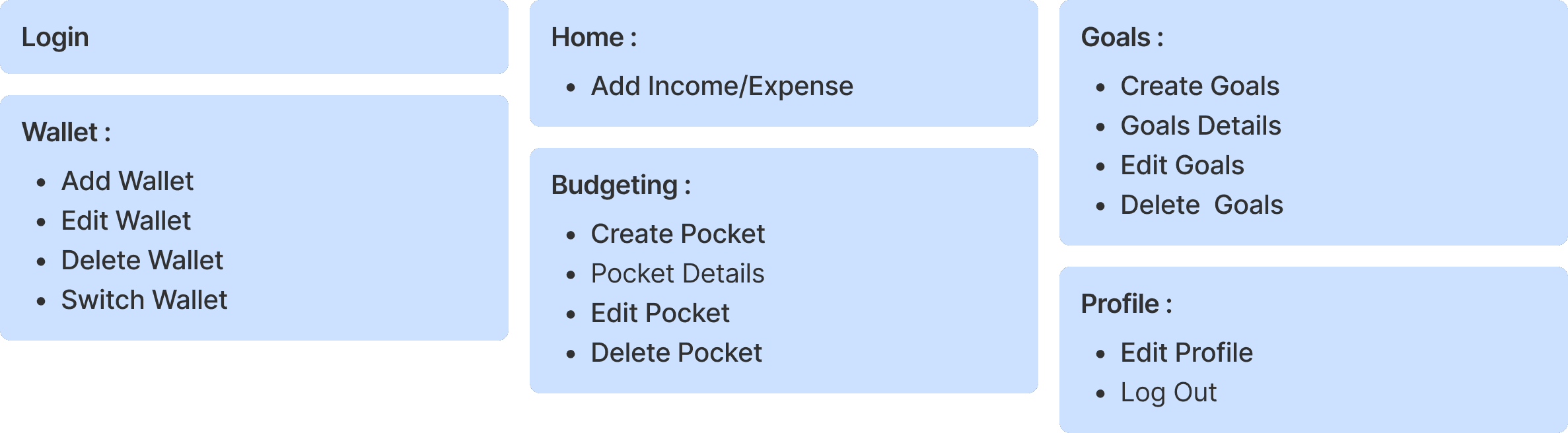
Followed a Design Thinking flow: Empathize (survey + problem validation) → Define (pain points → problem statement → affinity diagram) → Ideate (How Might We, competitor analysis, empathy map) → Persona (Aditya Natanael, a graphic designer trying to save toward concrete goals) → Prototype (user flow, IA, wireframe → hi-fi in Figma) → Test (task-based usability test).
Solution
Three design decisions came directly out of the research:
- Goal Setting — frame saving as a specific target
- Smart Nudges — light, non-judgmental reminders when spending looks off-track
- Quick Input Flow — expense logging reduced to a short, guided flow instead of a long form, aimed directly at the "reluctant to log" pain point
- Visual Progress & Badges — small-win feedback to help the habit survive past week one

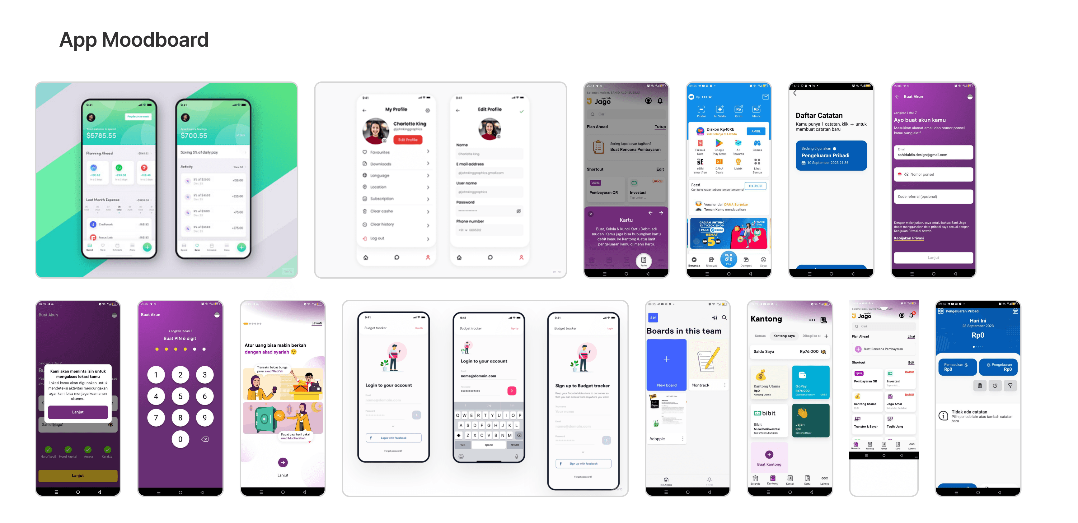
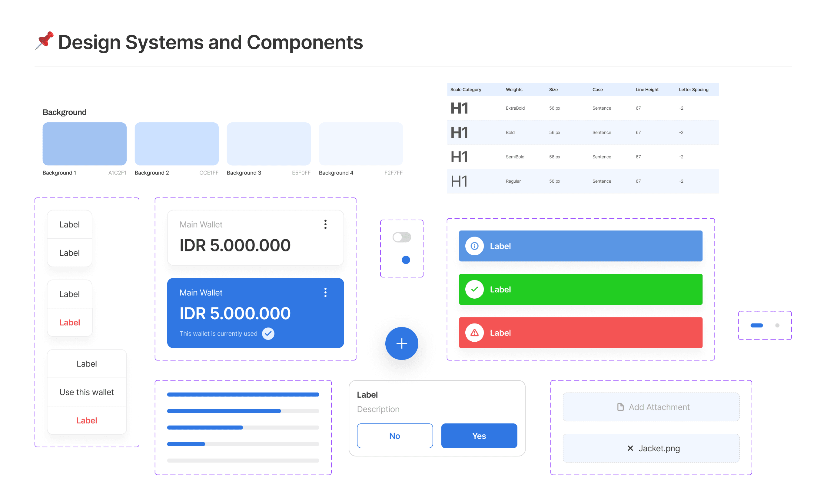
Moodboard exploration — soft colors, rounded icons, friendly typography to make finance feel approachable
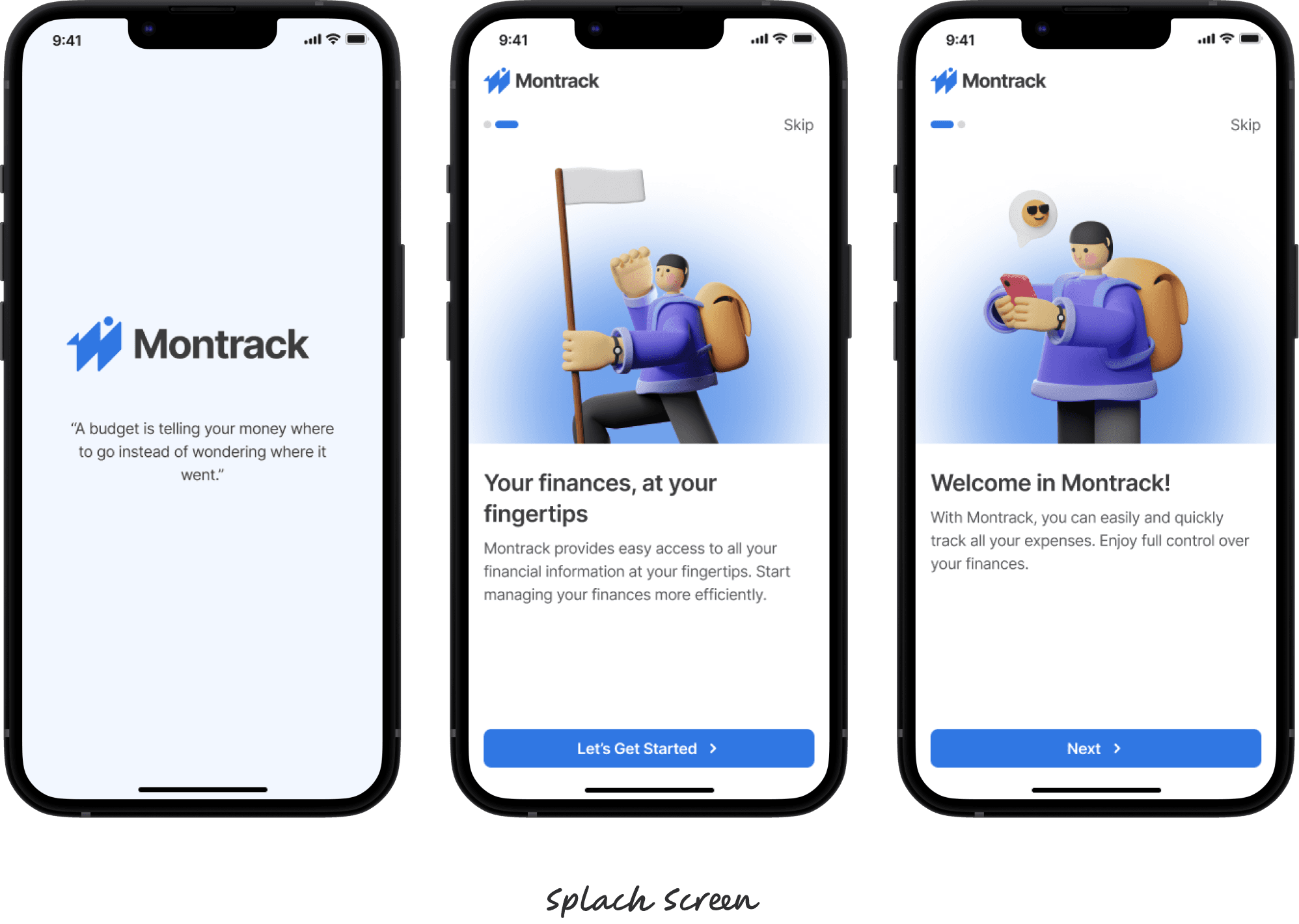
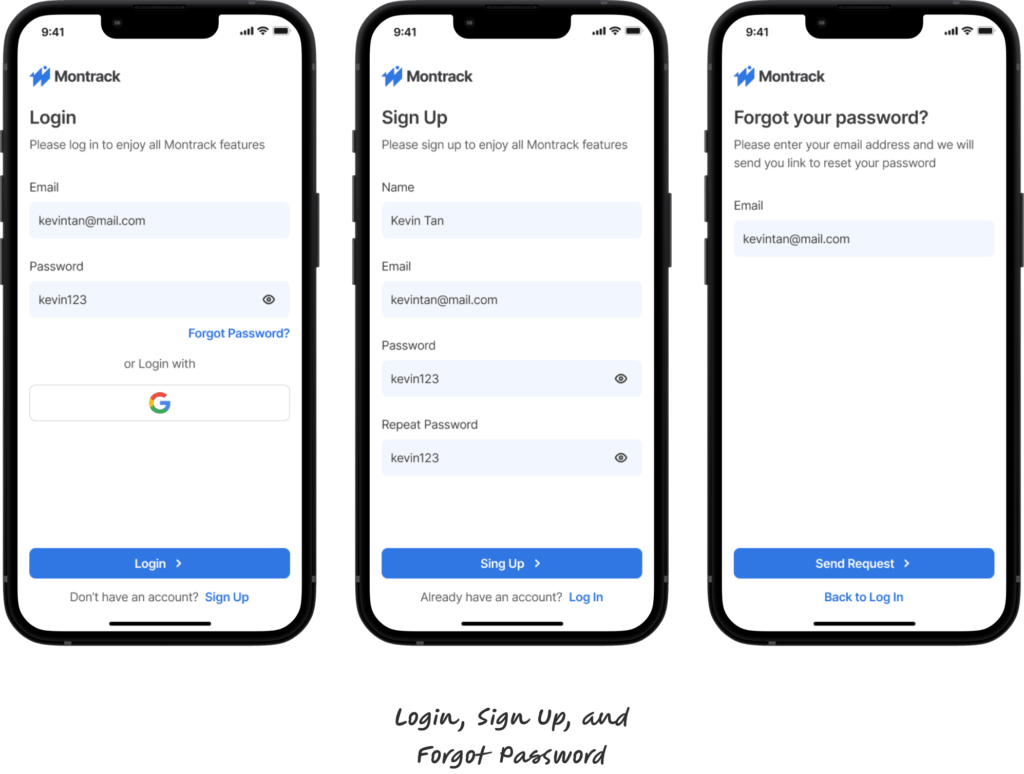
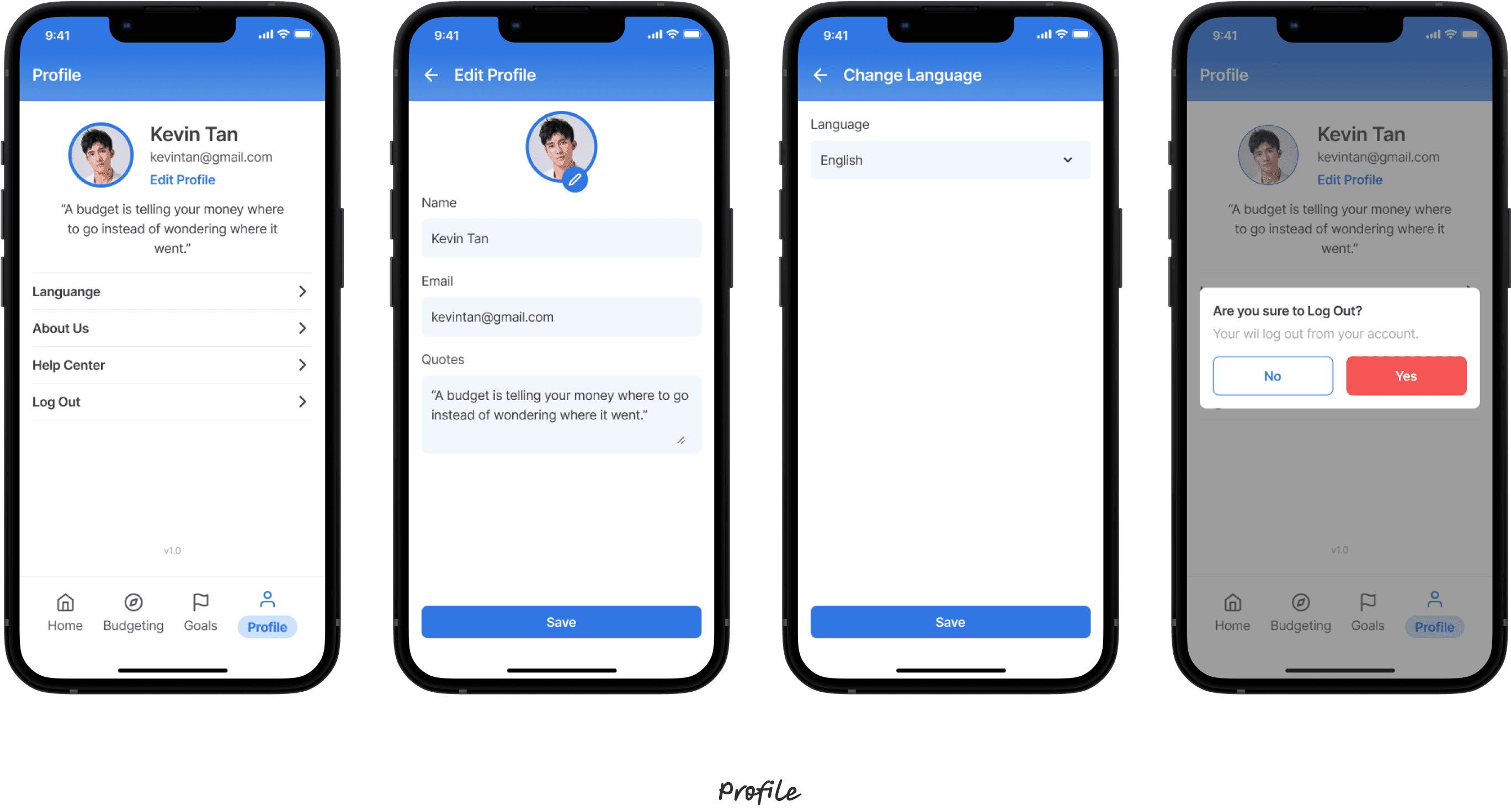
High-fidelity mockups
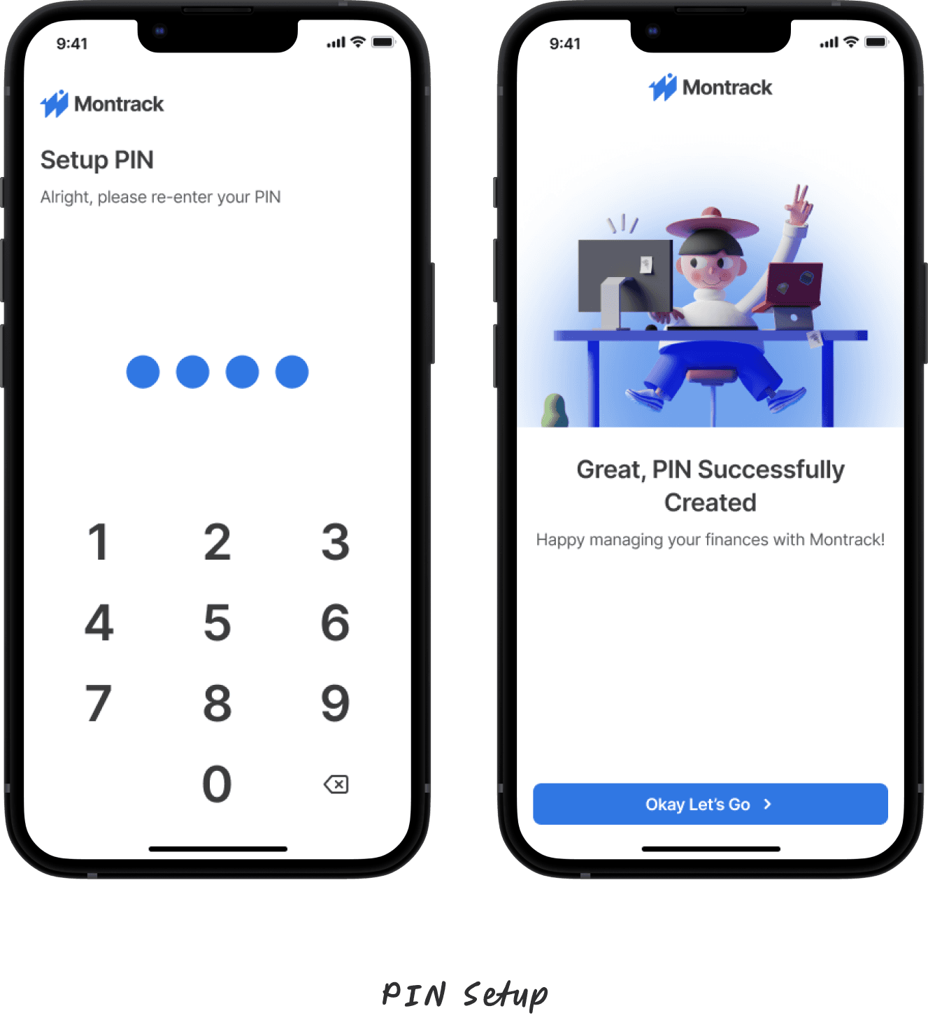
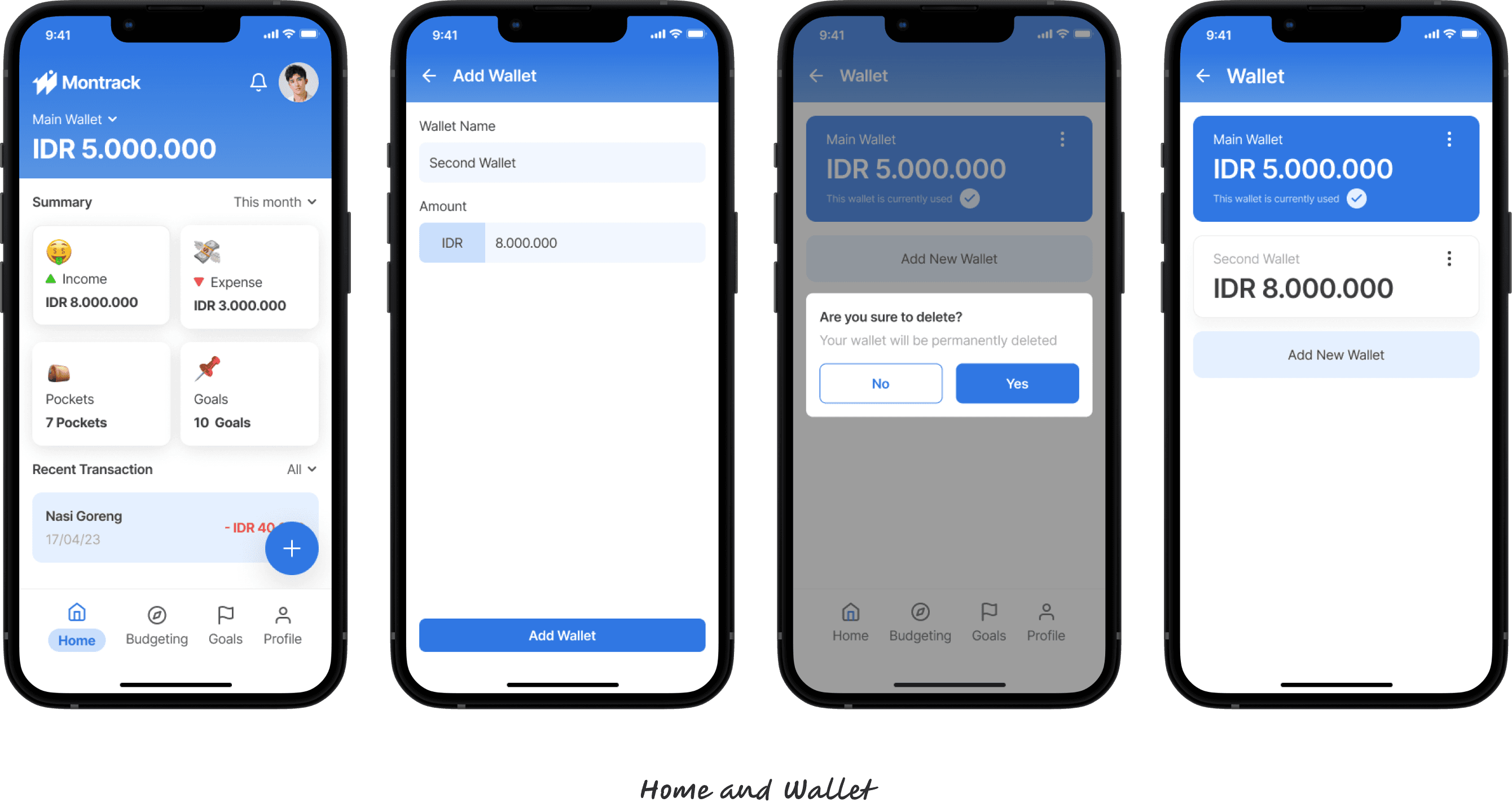
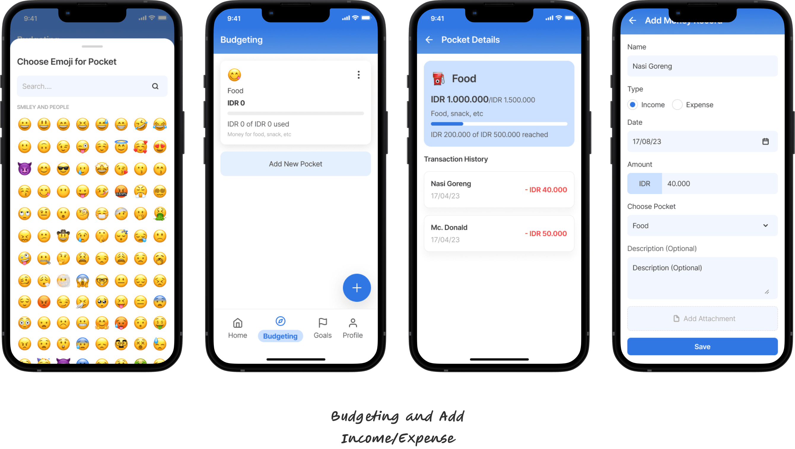
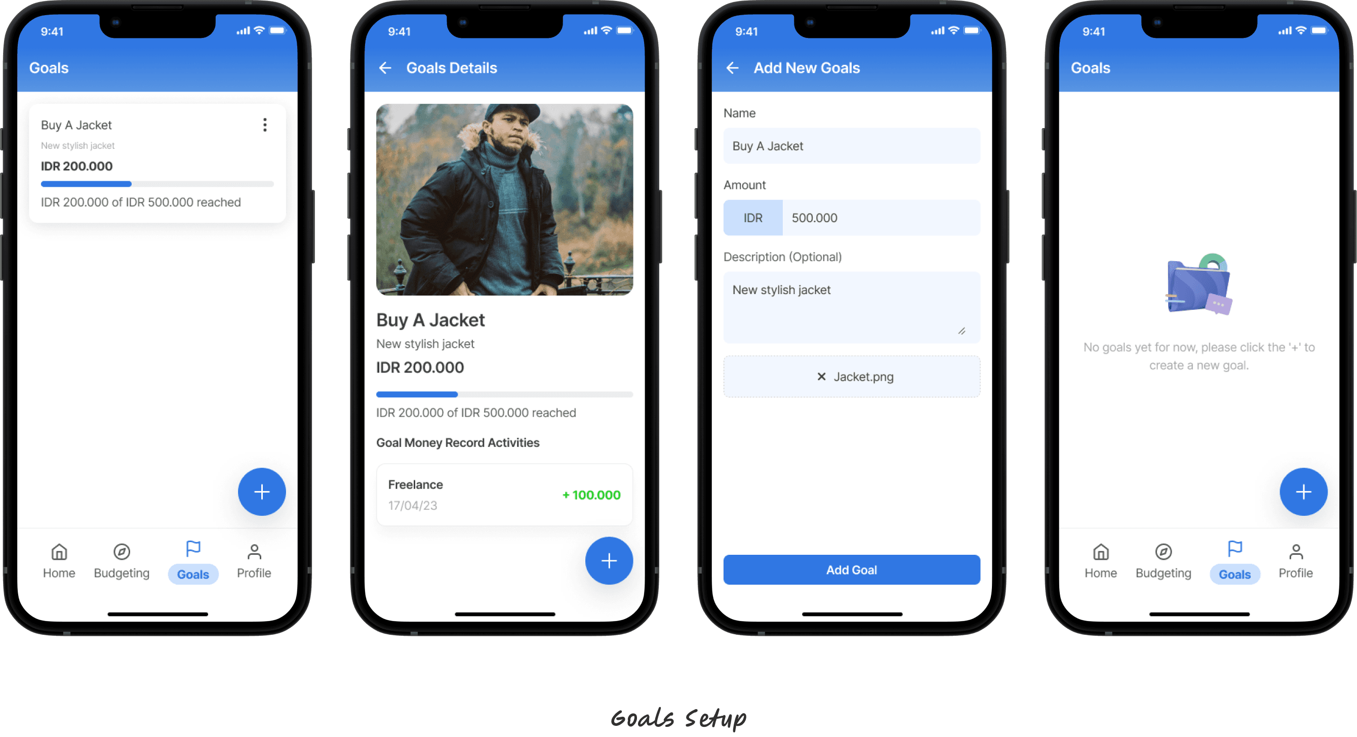
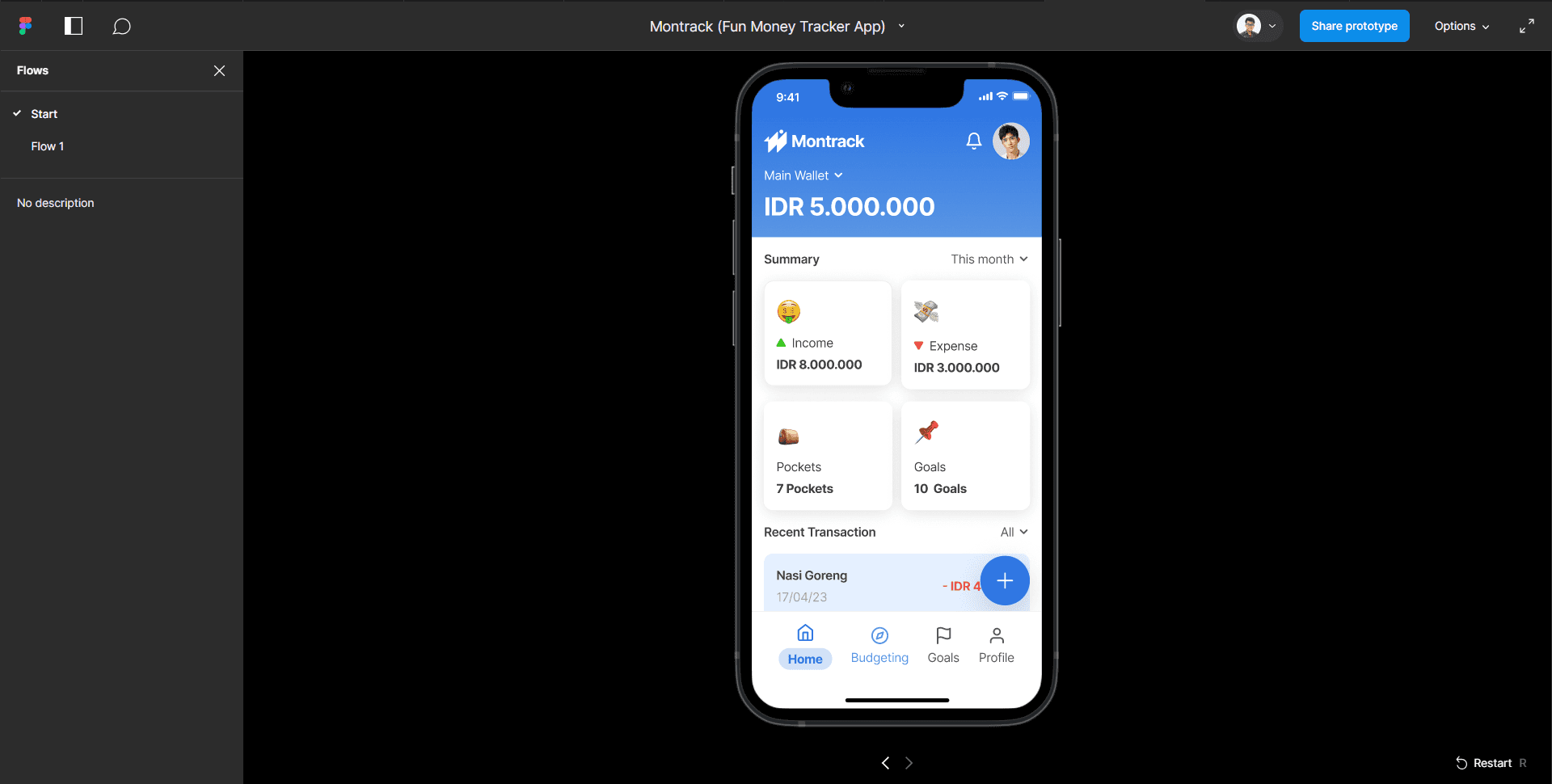
Try the live prototype on Figma
Result
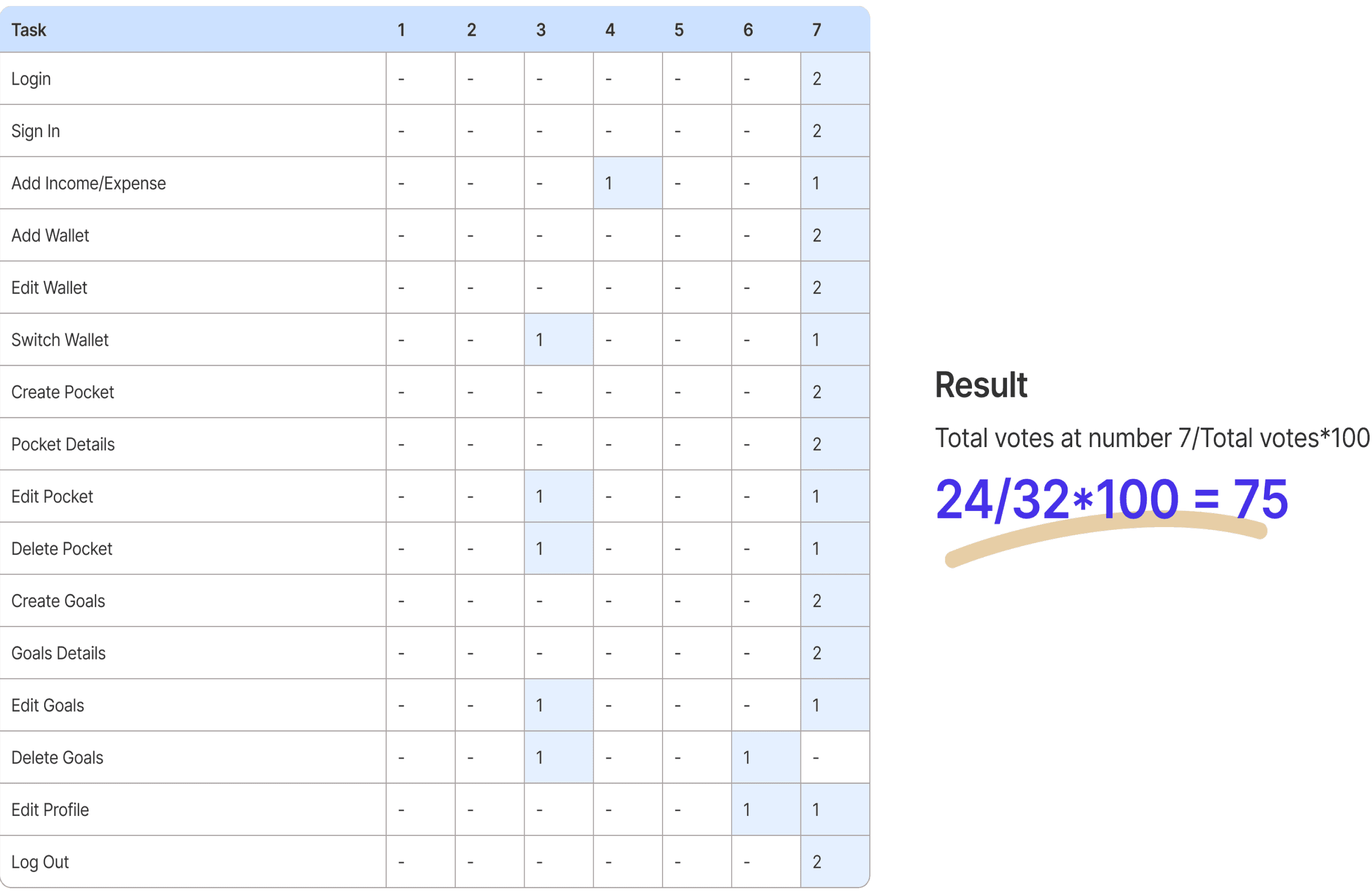
Ran a task-based usability test on the clickable prototype using the Single Ease Question method — a quick per-task ease rating rather than a full System Usability Scale survey.
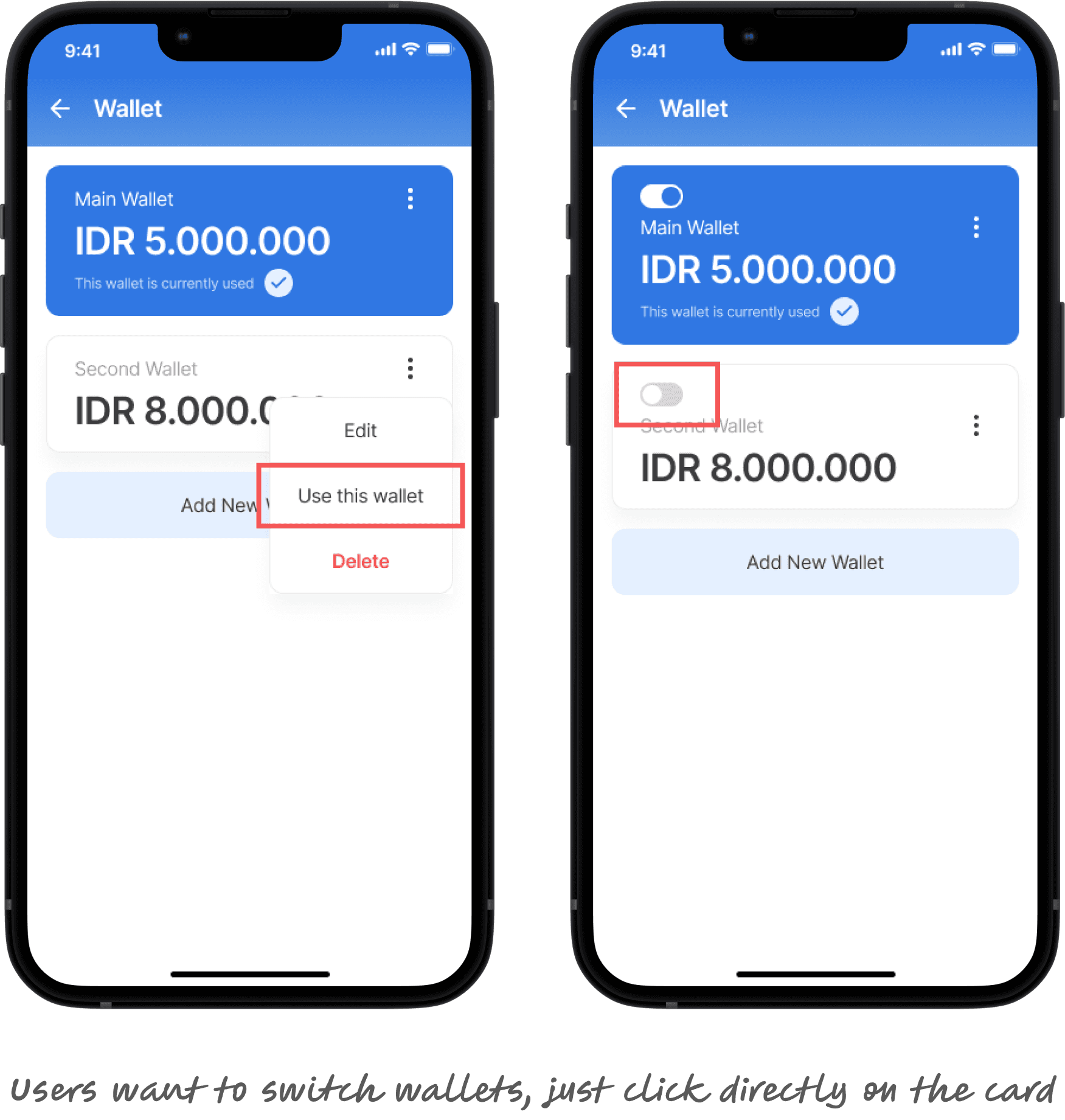
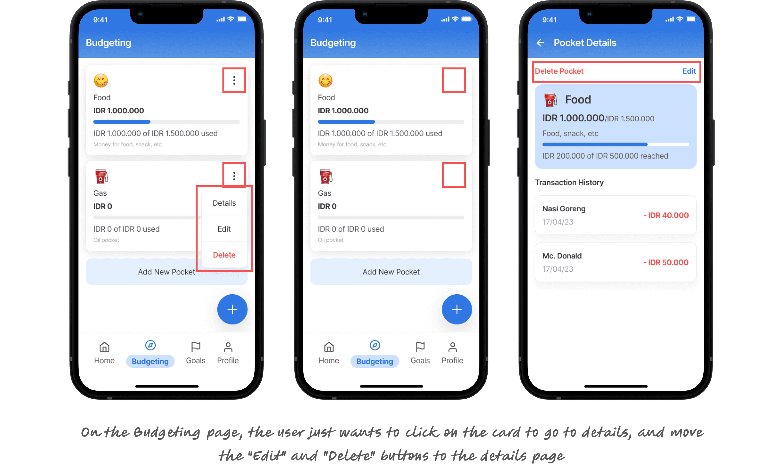
Friction consistently showed up in the same spots for both testers: switching between wallets, and editing or deleting existing Pockets and Goals — these edit/delete actions were noticeably harder than the core create-and-track flow, which felt smooth for both testers (login, adding a wallet, creating a Pocket, creating a Goal, and logging out all rated effortless). Adding an income/expense entry also showed mild friction for one tester.
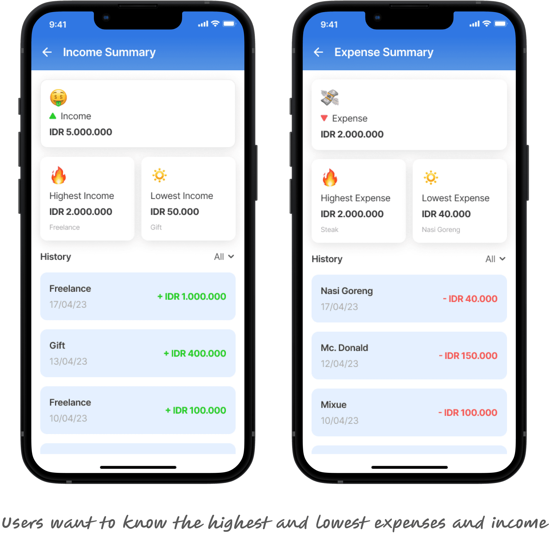
Based on this pattern, navigation for the edit/delete actions was simplified and a micro-interaction was added to make wallet switching feel more direct.
Learning
Good design turns a difficult habit into an easy one. Montrack reinforced that UX isn't just visual — it's about shaping behavior through small, well-placed moments of friction reduction and encouragement. If I revisit this project, the next step is closing the loop with real usage data instead of just prototype testing, to see whether the habit actually sticks past week one.
