
Rumahweb Order Domain Page Redesign
An internship project at Rumahweb, where I redesigned the domain ordering page to make it more intuitive and consistent. Reviewed by my internship mentor at 80/100.
"Design succeeds when the user doesn't have to think twice." — Steve Krug (Author of Don't Make Me Think)
Context
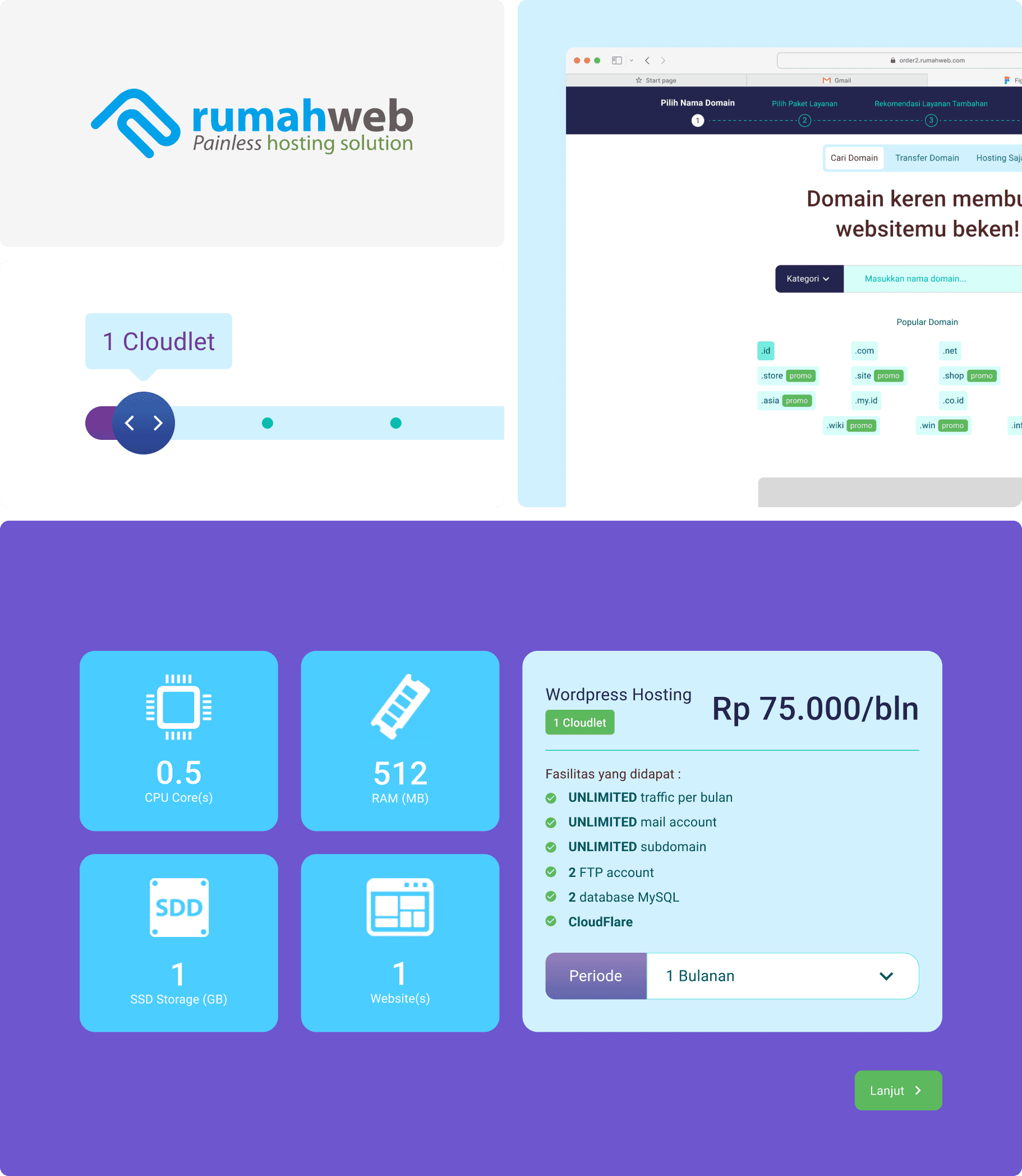
During my internship at Rumahweb, I worked on redesigning the Domain & Hosting Order page — a key touchpoint where users purchase domains and hosting services. The existing page had visual inconsistencies and a lack of clear hierarchy, which could make the ordering process harder to follow than it needed to be.
Constraint
This was early in my design career, and I'm upfront about what that means for this project:
- No structured research or testing practice yet — the redesign was driven by visual/UX intuition and design principles (hierarchy, consistency, whitespace), not by user research or usability testing
- As an intern, I didn't have access to production usage data — funnel drop-off, support tickets, or analytics — to establish a baseline
- Reviewed by my internship mentor at 80/100, based on visual execution and structure — a subjective design review, not a usability metric
I'm including this project as an honest formative piece rather than an evidence-backed case study. It sits in what I'd now classify as an Existing + Mass redesign (a live page, a large anonymous customer base) — but without the research foundation that kind of project normally calls for. That gap is part of the story, not something to hide.
Problem
My assessment at the time, based on design heuristics and observation rather than formal research: the order page lacked visual hierarchy and consistency, which likely made the multi-step purchase flow — domain search → hosting selection → checkout — harder to follow than necessary.
Approach
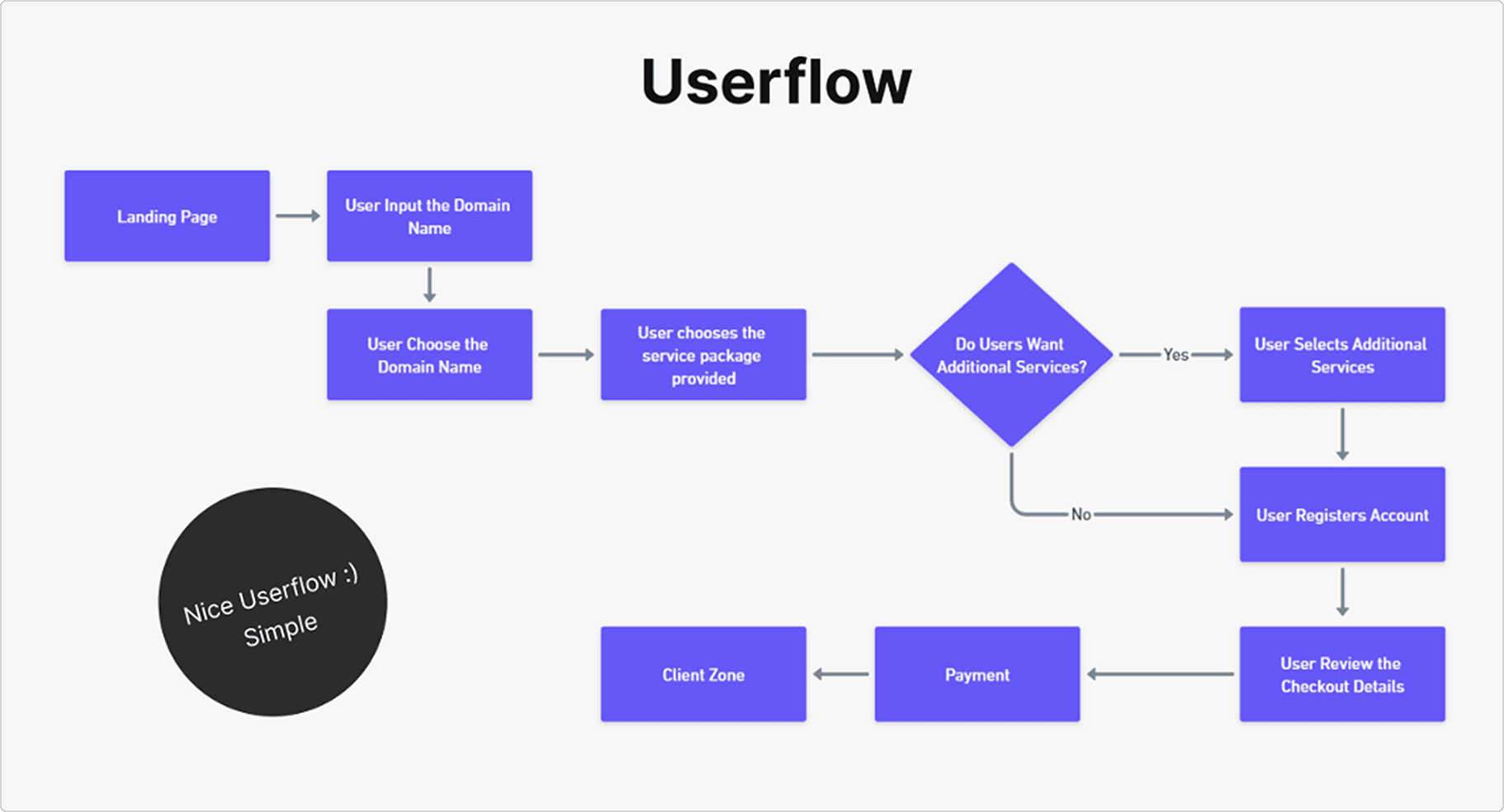
Before moving into wireframing, I mapped a simple order flow to understand the user journey within the system, aiming for a clear step-by-step experience that guided users through each decision point without unnecessary friction. This became the foundation for the page layouts in the next stage.
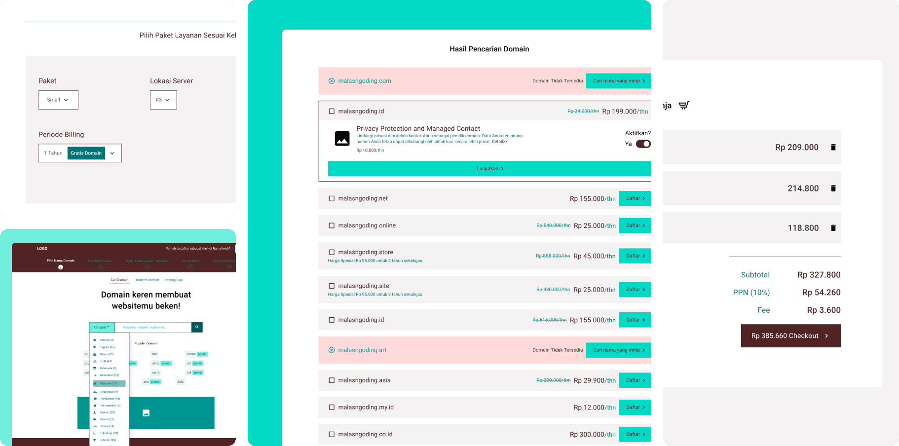
Wireframes were developed next to define information hierarchy and layout composition before finalizing the visuals — where to place the domain search bar, pricing and hosting options, and CTA buttons and supporting information. Through the wireframes, I explored different ways to display plan comparisons and CTA emphasis, so users could quickly identify what to do next.
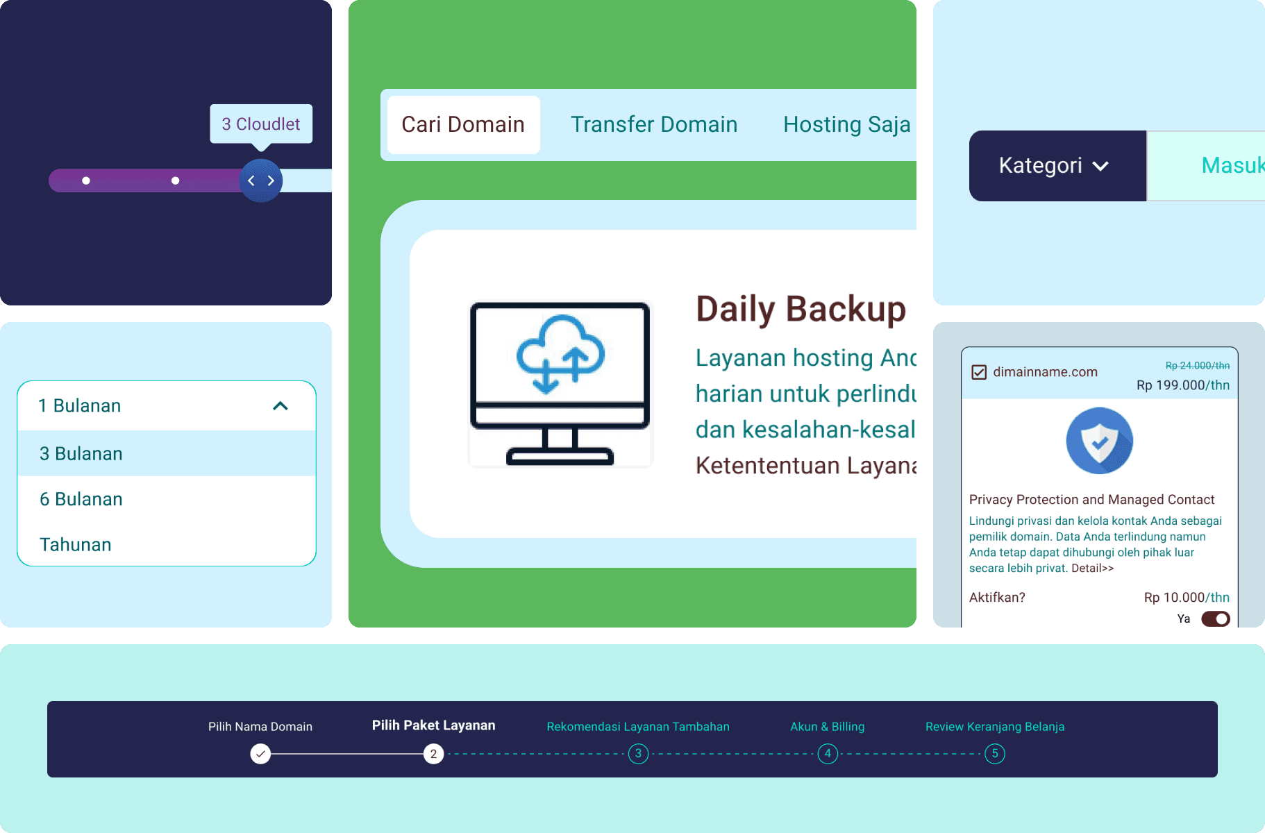
A concise design system followed, to keep the page visually consistent and scalable: a typography scale for headings, descriptions, and labels; a color palette aligned with Rumahweb's brand identity; and button/input components for various interactive states.
Solution
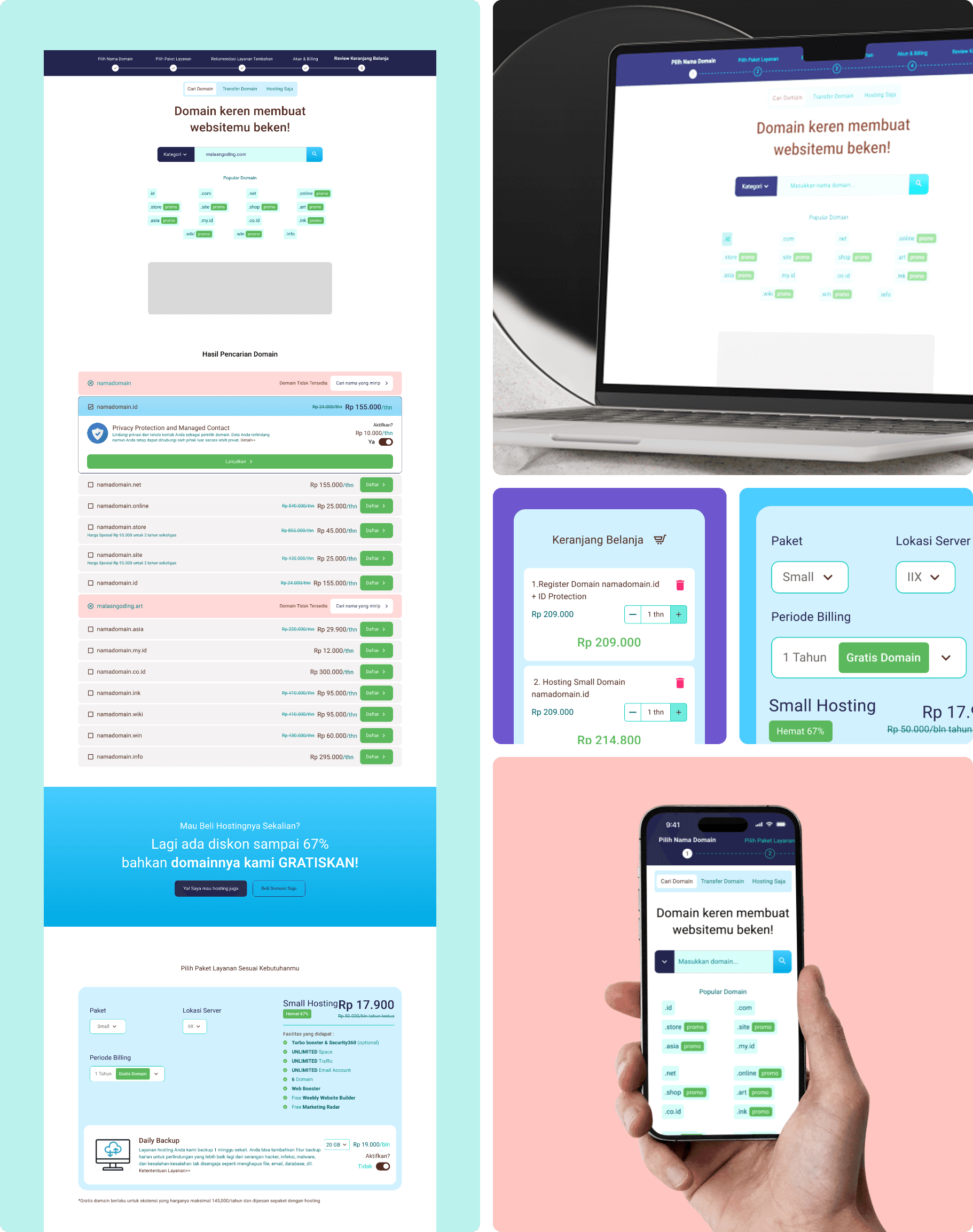
The wireframes and system guidelines came together into a high-fidelity interface built for visual clarity and improved usability: a cleaner, more modern layout with stronger alignment and spacing, simplified sections separating domain search, hosting selection, and checkout, and consistent visual cues to help users track the progress of their order.
Result
This project didn't include a validation or testing phase — a gap I'm aware of and have since corrected for in more recent work. The only external review was my internship mentor's assessment (80/100), which reflects visual execution rather than a usability outcome.
Learning
This project reminded me that good UI design isn't about adding more — it's about making every element meaningful. Looking back, it also marks the start of a gap I've since worked to close designing from intuition is a reasonable starting instinct, but pairing it with structured research is what makes a redesign defensible, not just better-looking. That shift is visible in the projects I've done since.
